The goal of this lab was to become familiar with
supervised classification, which differs from unsupervised classification learned last lab. With this method of classification, the user is given more control over the classes generated by the software, which in this case is ERDAS Imagine.
Methods
Part I: Collection of Training Samples for Supervised Classification
In the first part of this lab, the objective was to collect various land use/land cover samples to "train" the classification scheme, as the name of this section implies, through the use of drawing polygons and inputting them as areas of interest (AOIs) in the
signature editor window.
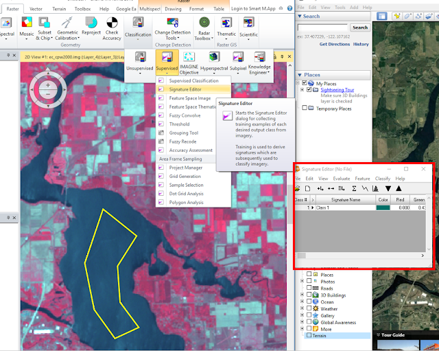 |
| Figure 1: Adding a polygon to the signature editor (as an AOI). |
In
Figure 1, the yellow polygon shown on the left side of the image represents a
training sample used for the water classification, and the red box highlighted on the right side of the image represents the
Signature Editor window with the lake AOI shown as
Class 1. This title was later changed to say "Water 1" and 11 more training samples were collected for water. Forest, agriculture, urban/built-up land, and bare soil samples were also collected through a similar procedure; in total, 50 signatures were used.
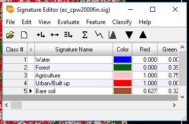
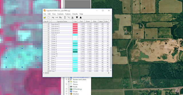 |
| Figure 2: Completed signature editor. |
In
Figure 2, the signature editor window is displayed having 50 sample signatures with different labels to reflect the land cover/land use of each associated polygon. Google Earth was used to verify that the sample signature being collected was accurate.
Part II: Evaluating the Quality of Training Samples
In the second part of this lab, the goal was to evaluate the training samples collected from part 1, by ensuring that their spectral signatures represented those of their respective land uses/land covers in the signature editor window. Then, the samples were compiled to create supervised classes of each of the land uses/land covers.***
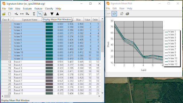 |
| Figure 3: Displaying the mean plot of water signatures collected from part 1. |
In
Figure 3, the
Signature Mean Plot window is shown on the right side. This displays the mean reflectance in each spectral band for all water samples collected. The purpose of this step was to identify any outliers. If one spectral signature looked completely different than the majority, that sample was deleted and a new sample was created. This was done with the rest of the class samples.
Next, the separability between the class samples were evaluated by first adding the spectral signatures of all samples collected to one signature editor window, then running an
Evaluate Signature Separability model (see
Figure 4).
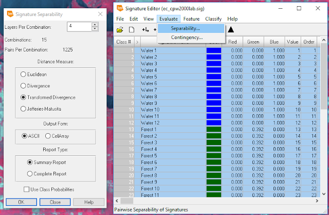 |
| Figure 4: Evaluating signature separability in the signature editor window. |
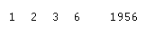 |
| Figure 5: The spectral bands with the greatest separability between classes are on the left (1, 2, 3, and 6), and the average separability score is shown on the right (1956). |
After running the model shown in
Figure 4, a separability report was generated and the numbers shown in
Figure 5, were captured from that report. Based on the sample signatures collected, the spectral bands that display the greatest separability between classes are the blue, green, red, and near infrared (NIR) bands; and this is what the classification scheme should be based on. The average separability score shown in
Figure 5, "1956", means that the amount of separability within the class sample signatures was sufficient and classification could commence. The next step was to merge all of the classes into individual discrete classes by using the
Merge function in the
Signature Editor Window (see
Figure 6).
 |
| Figure 6: Discrete classes. |
The raster tool,
Supervised Classification, was then used to classify the rest of the image based on the mean sample signatures (see
Figure 7).
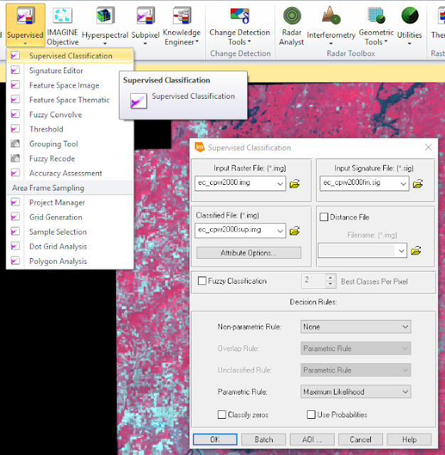 |
| Figure 7: Running a supervised classification model. |
In
Figure 7, the
input image was the multispectral image shown in the background, the
input signature file was the signature editor created in the previous step (see
Figure 6), and the
classified file was the output image which was given a name and location.
Once the output image was generated, it was compared to the unsupervised image (see
Results).
Results
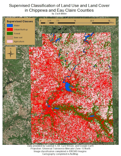 |
| Figure 8: Completed supervised classification map. |
Conclusion
Looking at the results, this classification scheme did not produce an accurate result. Urban/ built-up land dominates the image when in reality, there are a lot of misclassified areas to the far east, west, and south of the Eau Claire and Chippewa Falls areas that are predominantly agriculture and forest. A lot of water was misclassified as urban/ built-up land as well. The section of the Eau Claire river between Lake Altoona and Lake Eau Claire provides a good example of this, but also, there are parts of the Chippewa river just southwest of Eau Claire that was classified as urban/built-up land. The reason for this poor accuracy could have something to do with the variety of spectral signatures for urban/ built-up land. Since roof tops, roads, and other highly reflective surfaces and materials were sampled as urban/built-up classes, some of the spectral signatures of agriculture, water, and bare soil were incorrectly grouped in with the urban/built-up class.
Sources
Landsat 5, Dr. Cyril Wilson, Google Earth, ArcMap, and ERDAS Imagine


No comments:
Post a Comment